Thursday, November 11, 2010

Final Crit and Reflection

Presentation Panels and Models

Overall I was pleased with the feedback from the review panel.

The presentation overall was laid out and presented well. The images and views presented showed a good understanding of space, feel and look of the centre.

The design:
Multiple entry points were a good idea to separate functions. The subtlety of these were well designed to not overtake the façade and draw attention to users entering or leaving, as this would be a sensitive issue to many.

The dividing of the ‘old vs. new’ was an intelligent move. This allows minimum disruption to the existing terraces and allows the proposed centre to be integrated using contemporary materials and building techniques.
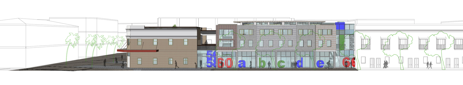
South Elevation

Separating private functions from public made sense in that privacy and security issues were addressed. This was also said about the separating male and female dorm rooms.

Who was running the show? It wasn’t made apparent who the client was. I did verbally clarify that it was a joint venture with the City of Sydney and a charitable foundation with existing programs  in place. (My programming was developed from the research and interviews with Weslsy Mission)

Section A - The section showed stairs from the lower ground floor to the first floor. This mislead that the connections were in a longitudinal direction (west to east) the centre was divided from public, semi public/private to private. This again was not made apparent on plans. On further reflection there are a few design decisions I could adopt to improve to where the journey ends.  – See sketch plans below.

UPDATE WITH SKETCH


Model: It was a general census was that the model was crap.
The site model was made a wee while ago and it has been used as a site analysis and working model. It was never pretty but was to scale and served as a design aid. This however should have been made much neater for presentation to sell my scheme. This can be said about the 1:100 models. With only 2 days to make it I didn’t get time to finish this model with screening and trees.
I am going to paint the 1:100 model and hopefully cover the scars and remake the site model for the exhibition.

I wish to thank the 9 sights studio, Paola, tutors and the review panel for a great day and year. 
It was a great experience to formulate my own brief, programming and design. I found this a satisfying conclusion to my 5 years of architectural study. My project thesis question was challenging and rewarding that I now have another level of understanding in social design.

Sunday, November 7, 2010

The Presentation


The above link is a summary booklet of presentation material for my final review.

Shadow Diagrams
9am, 12noon, 3pm (Respectively)

Through out the design process I constantly referred to my site analysis and other environment barriers to enhance my design. The shadow diagrams allowed me to work out the best design strategy for the bulk and scale of the buildings when placing them on the site.

Images, CAD and Models.. Oh my!

My schedule and programming for work to be completed in preparation for the final review went out the window. More time was spent on tweaking the design, editing layouts and planning. Enough is enough! I had to stop and move onto renders, views and the plans, sections and elevation.

I have been working in 3D in vectorworks 2010 and renderworks. The model was set up with Helidon’s, site lights and internal spotlights and down lights. This caused pain in learning how to place, direct and set brightness and colour to capture the feeling and look of my design. I felt it was important to show night time ‘shots’ of how the centre will look and be used at night. Security being a major concern a light deign was needed to light, passageways, the courtyard and the external façade leading to entry points and the three streets that surround the centre.

Working in 3D CAD and using my sketches allowed me to envisage how the architectural spaces will feel. This was a substitute to concept physical models.  Advantages of both can be argued but time and money were a factor to consider in my approach.
'As an afterthought physical models would have been of benefit to have something tangible for peers and tutors to review'


Apartment LivingRoom
Apartment Bedroom


Courtyard - NightTime
Courtyard - Looking East

The renders and images produced were selected to show key circulation areas and spaces and external views from the public domain, both at day and night.
The circulation images have a pathway in yellow; yellow being the colour of education, safety, joy and to identify the way home, made popular by the wizard of oz.

Hostel Corridor

Hostel Main Foyer

Hostel Bland St Entry


Just Keep Going

After the last review I did my own critical review of my design. This included: internal layout, materials and structure, urban design, landscape plans and roof design.


Draft Ground Floor Plan Courtyard Design

I posted more questions on the homeless forum focusing on bedroom layouts and the relationship between male and female areas, whether a uni-sex or separate living areas work.
The response was great. It was suggested that the uni-sex environments are great for development, however with my target users these areas would have to be monitored and supplied with condoms and birth control. A separate male and female dorm was favoured with a unisex communal room. This made more sense and allowed for maximum security. Each dorm would have a keyed entry.


Concept 1 Hostel Bedroom

Concept 2 Hostel Bedroom

Entry and Courtyard Concepts

Study and Concepts for Stairs


Further research into landscaping and street trees for the Woolloomooloo locality allowed me to draft up a landscape plan and urban design that is integrated with the existing streetscape and Pedestrian Street paving pattern.

I extended the green space vertically to the roof tops of the apartments and the hotel to create communal gardens, seating and learning areas. These areas can be used by the users only. Allowing for social interaction and/or personal reflection, all while looking at the beautiful Sydney skyline.

Structure:
A hybrid design was always going to be used to maximise the performance of the building and allows for more flexibility in material use. Structural concrete panels with insulation and concrete veneer panel and concrete replaced convention masonry wall types.
‘Bubble deck’ floor slabs will be used to allow for large spans for greater flexibility and reuse, reduced concrete content and easy of construction.
The roofing would be composite roofing system. This allows for large spans, trafficable roof and reduces the need for roof trusses and structure.
Draft Sections and Details

Power, ventilation and water:
A PV system will be installed on the hostel roof. Tracker PV systems with frames will be located on the other roofs, doubling up as shading devices.
Roof water and run off will be collected in an underground rainwater tank to be reused for irrigation, flushing, laundry and basins. Blackwater will be reused for irrigation.
Heating will be through passive means and thermal mass. In addition a ground heat pump will assist in heating the centre.
No air-conditioning will be installed. Rooms have been designed to allow for cross ventilation with adequate shading, reducing heat load.


Draft Section - ESD schematic

Bricks and Mortar

An early design consideration was to maintain the materiality language that was sympathetic to the streetscape and existing buildings surrounding the centre.

The common materials found are glass, masonry (clay brick), timber, concrete and steel.


The use of materials is important to create an attractive, welcoming and homely centre were the users can feel as easy. (Brick and timber, homely materials, creates a sense of place)

In my design I have used a combination of concrete blocks, clay brick and concrete panels. A mix of masonry materials allows for more flexibility, durability, constructability and distinguishes old from new.

Off form concrete panels will create patterns and textures that will be unique and contrasting to the cold, hard surface of concrete. Concrete block work with colour pigment will break up the vertical surface and allow for a more interesting façade.

To further offset the concrete material, timber screening had a natural, soft material that supply’s privacy and security as well as an attractive. FSC hardwood or recycled timbers would be selected. Timbers with a maritime life would be preferable to maintain a link to the Woolloomooloo history.

Painted screens add a personalised touch to the centre. Allowing users to ‘make their own’ imprint. Creating a sense of ownership, pride and involvement in the centre, creating a community where they can feel included. This indirectly links to the Artspace centre adjacent to the centre where the workshop in the public zone allows additional artwork and installations to take place.

Glazing plays a big part in the security and performance of the building. Large glazed windows overlook the courtyard and street for users to observe, supplying addition security to the users and public that uses the centre.
A combination of sliding, hinged and louvre windows can be found throughout the centre. Operable windows assist in cross ventilation and solar access.

The colour palette plays an important role in setting mood, feel and recovery. 

Red: An emotionally intense colour. It enhances human metabolism, increases respiration rate and is it’s highly visible. Red represents joy, sexuality, passion, sensitivity, love, willpower, leadership and courage. On the other hand it signifies malice, rage and danger.

Green: The colour of nature! It symbolises growth, harmony, fresh, stability and safety. Green is a very healing colour which is most restful for human eyes. Green can be seen in road crossing signs, chemists and peace.

Yellow: Associated with education and intellect, happiness, joy and evokes happy feelings. Many children’s toys use yellow, which can also be seen in signs, food outlets.

Blue: is the colour of the sky and sea. It symbolises trust, loyalty, wisdom, truth and faith. It is a colour that is strongly associated with tranquillity and calmness.

White: associated with light, innocents, purity and virginity. White is used to show cleanliness, safety and in contrast with other colours shows positive connotation.